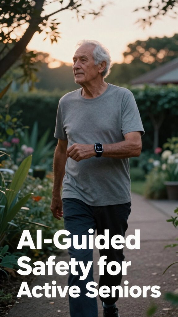
Dad’s New Confidence: Why I’m Championing Accessible Stair Safety
My 79-year-old father, Robert, nearly took a tumble last March. That moment shook me. I started researching aging-in-place solutions for SilverSoma because I wanted him thriving, not just surviving. Bold yellow edge detection strips transformed his split-level home in Portland. No clinical vibes—just smart dignity. High-contrast tactile markers. Independent living preserved. That’s what modern senior environments should offer.
Last April, I watched Dad descend our stairs alone for the first time since his fall. He gripped the railing confidently. Those vibrant contrast markings weren’t just safety features—they were his ticket back to autonomy. He even joked about the “fancy NASA technology” I’d installed. That moment? Pure gold. Aging gracefully doesn’t require sacrifice.
Quick Takeaways
- High-contrast, textured stair markings improve visibility and safety for seniors in modern homes.
- Bright hues like yellow or orange enhance confidence and reduce fall risks on staircases.
- Easy-to-apply adhesive strips combined with smart lighting optimize visibility under various conditions.
- Incorporating tactile flooring and innovative designs supports independence and Dignity for seniors.
- Advanced technologies like automatic edge detection further enhance safety while maintaining aesthetics.
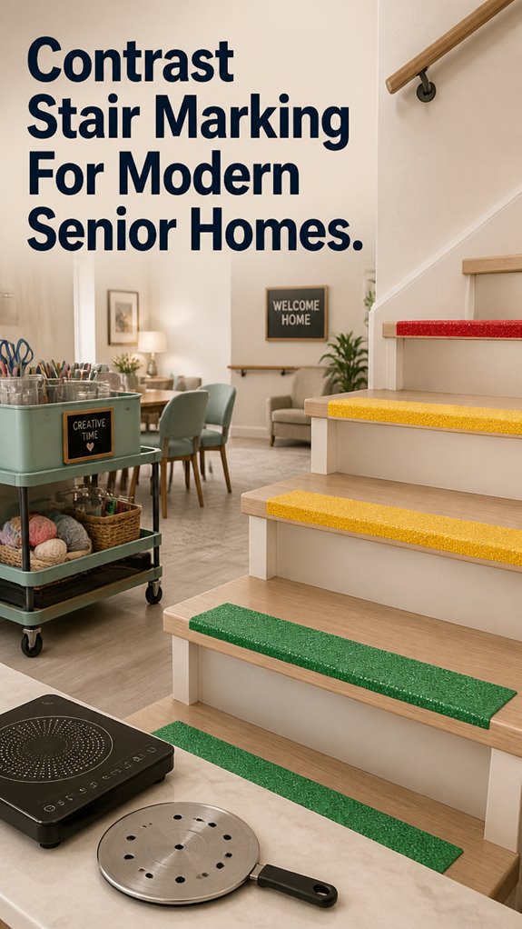
Why Stair Contrast Markings Are Critical for Senior Safety
You know, if there’s one thing I learned from years in the corporate world, it’s that proactive beats reactive every single time—yet most homes still rely on those tired old safety solutions like handrails and stubbornly dull stair nosings.
It’s time to ditch the beige and embrace contrast stair markings, using color psychology to boost visibility and confidence. Bright, bold hues don’t just look modern—they tell the brain, “Hey, caution ahead!”
This isn’t just compliance; it’s about empowering my dad’s independence with stylish, functional safety designed for real life—so he can feel secure, dignified, and ready to conquer each step.
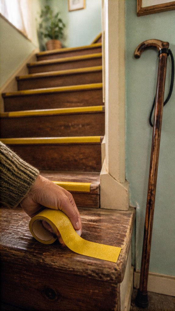
Choosing the right high contrast stair tape can make all the difference in enhancing safety and preventing falls. Incorporating contrast stair strip solutions offers a simple yet effective way to elevate stair visibility and reduce trip hazards for seniors.
How to Choose the Best Materials and Designs for Contrast Markings
Getting the materials and designs right for contrast stair markings isn’t just about slapping on some paint and calling it a day—this is where modern safety meets smart design, and it really pays to get it right. Think tactile flooring that guides without fuss, combined with smart lighting that makes steps pop, all while respecting dignity.
Skip dull, traditional tapes—opt for high-contrast, textured strips that cue the eye and foot. Why settle for old school when your space can embrace innovation?
It’s about empowering your dad’s independence while making his home safer chic and seamless—because better design is liberation, not just safety. Modern one-touch consoles can even be integrated into safety systems for easy operation.
Easy Steps to Install and Maintain Stair Contrast Safety in Your Home
Turning your dad’s home into a smart sanctuary means the fun part—installing those sleek contrast streaks on the stairs—should be straightforward, not a maze of tangled tape and confusing tools.
Use simple adhesive strips that can easily be cut to size, then apply with confidence. For a modern twist, integrate lighting automation with color customization—set the contrast hues to shift based on the time of day or ambient light.
This way, walking up or down feels natural and safe, with everything blending seamlessly into your vision of independence and dignity.
In addition, selecting high contrast materials ensures maximum visibility and safety on the stairs under different lighting conditions. Incorporating low noise appliances, like quiet dishwashers, can contribute to a peaceful and comfortable environment, which is especially beneficial in a senior home setting.
No more old-school safety paranoia—just smart, stylish steps forward.
High Contrast Stair Markings
Ever wonder why those dusty, faded stair strips from the old days are still the go-to? Honestly, they’re like the beige plastic of safety—stale, uninspired, and totally ineffective.
High contrast stair markings are a game-changer. By choosing bold, color-psychology-friendly hues—like bright yellow or vibrant orange—you boost visibility and confidence. Weighted walking sticks offer additional support for those with stability concerns, making stair navigation even safer.
Lighting considerations matter too: proper illumination makes markings pop without glare, which is essential for high contrast address signs that are easy to read from a distance.
Visualize your dad, once again climbing stairs with ease and dignity, liberated from fear of slips. It’s about blending safety with style, honoring independence, and transforming aging hurdles into dynamic, empowering spaces—just like those sleek corporate offices you used to conquer.
Automatic Edge Detection System
There’s nothing quite as frustrating as wired sensors that scream “invasion” every time your dad moves—like working in a cubicle with a boss watching your every keystroke. That’s why the Automatic Edge Detection System is a game-changer. It detects the natural contours of stairs and floors, providing subtle alerts that keep your dad safe while promoting social engagement and cognitive stimulation. Incorporating top floor pressure sensors ensures even higher accuracy and reliability in monitoring movements. These sensors are designed for reliable detection, reducing false alarms and increasing confidence in the system’s performance.
Upgrading the home with these smart sensors means fewer false alarms, more independence, and less worry for you. Say goodbye to outdated safety nonsense—welcome effortless, invisible support.
It’s the perfect way to respect your dad’s dignity while you make his home smarter and safer.
Vivid Stair Strip Adhesives
| Bright Color | Non-slip Surface | Easy Adhesive | Durable Finish |
|---|---|---|---|
| Red, yellow, green | Yes | Peel-and-stick | Weather-resistant |
| The rolling craft carts can also be customized with vibrant hues to match your creative space. Using induction cooktop adapters for compatibility ensures safety and efficiency.
FAQ
How Do Contrast Markings Reduce Fall Risk for Seniors?
You reduce fall risk by using contrast markings, which enhance color perception under varying lighting conditions. These visible cues help you navigate stairs confidently, giving you a sense of freedom and safety in your home design.
Are There Color Options Suited for Specific Visual Impairments?
You’ll love the freedom of choosing stair contrast markings with color options tailored by color theory, enhancing aesthetic appeal and accommodating specific visual impairments—liberating your home’s safety and style effortlessly!
What Maintenance Is Required for Long-Lasting Contrast Markings?
You should regularly clean and inspect contrast markings to maintain their aesthetic appeal and material durability, ensuring they stay effective and vibrant. Routine upkeep liberates you from frequent replacements, preserving safety without sacrificing style in your senior home’s design.
Can Contrast Markings Be Integrated With Smart Home Safety Systems?
Visualize your staircase as a guardian angel, silently guiding you. You can integrate contrast markings with smart home safety, allowing sensor activation and voice control, freeing you from barriers and empowering your independence with seamless safety features.
Do Contrast Markings Comply With Universal Accessibility Standards?
Yes, you can design contrast markings that comply with universal accessibility standards, enhancing color psychology and reducing environmental impact by using eco-friendly, high-visibility materials, empowering you with safer, more liberated movement in your modern, inclusive home.